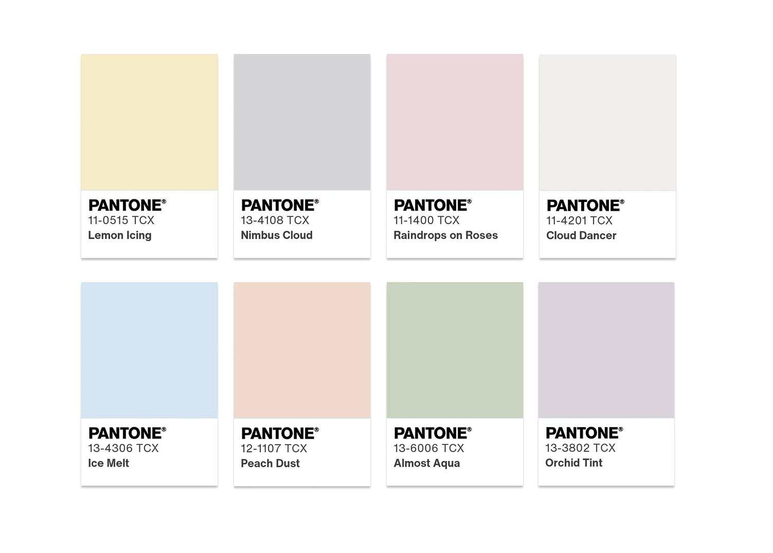
Pantone Color of the Year 2026: Cloud Dancer Ideas
The announcement of the Pantone Color of the Year 2026, Cloud Dancer, reflects a more restrained approach to color forecasting. Rather than highlighting a bold or expressive hue, Pantone’s 2026 selection centers on a soft white tone—an unexpected choice that has generated discussion due to its neutrality and minimalism.
As the first white ever named Color of the Year by Pantone, Cloud Dancer functions less as a directive and more as a design framework. Within event design, white has long played this role, serving as a foundational layer that allows florals, textures, lighting, and complementary colors to define the atmosphere. Viewed through this perspective, Cloud Dancer aligns with long-standing principles of refined, intentional event styling.
What Is Pantone Color of the Year 2026? Cloud Dancer
Cloud Dancer is best described as a balanced white that adapts to its environment. It is neither stark nor overly warm, which allows it to maintain visual continuity across spaces while supporting layered design elements.
In wedding and event design, this type of white enhances architectural features, emphasizes scale, and elevates floral craftsmanship. It performs particularly well in settings where natural light, candlelight, and photography play an essential role. As a foundation, Cloud Dancer allows the focus to remain on composition and detail rather than color saturation.
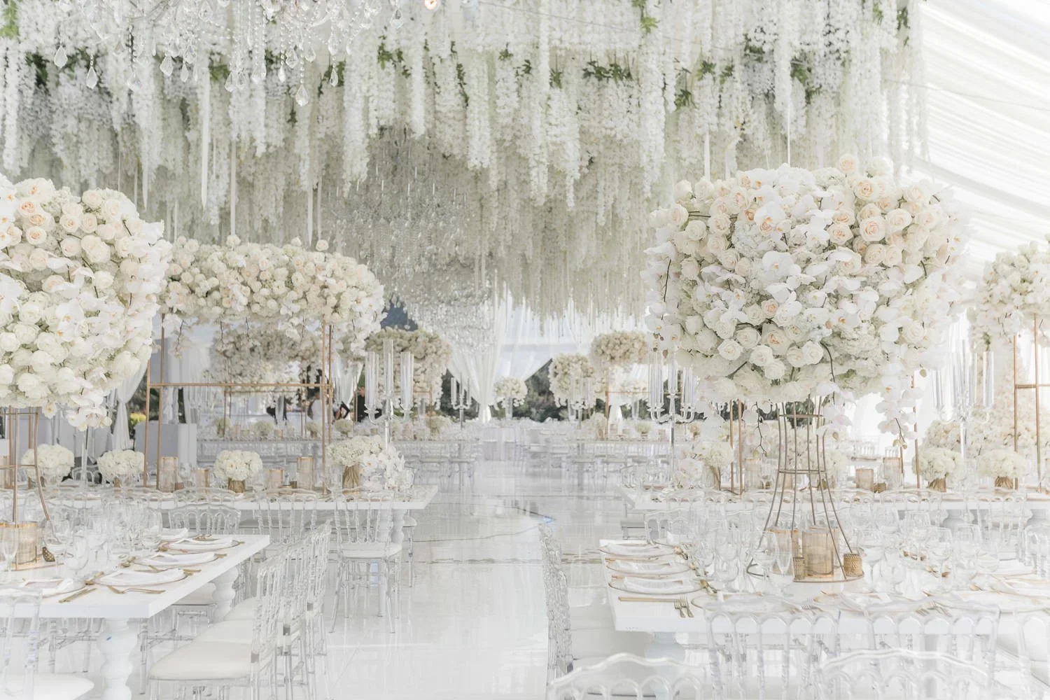
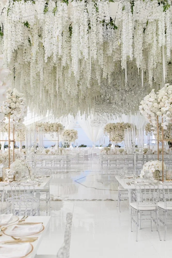
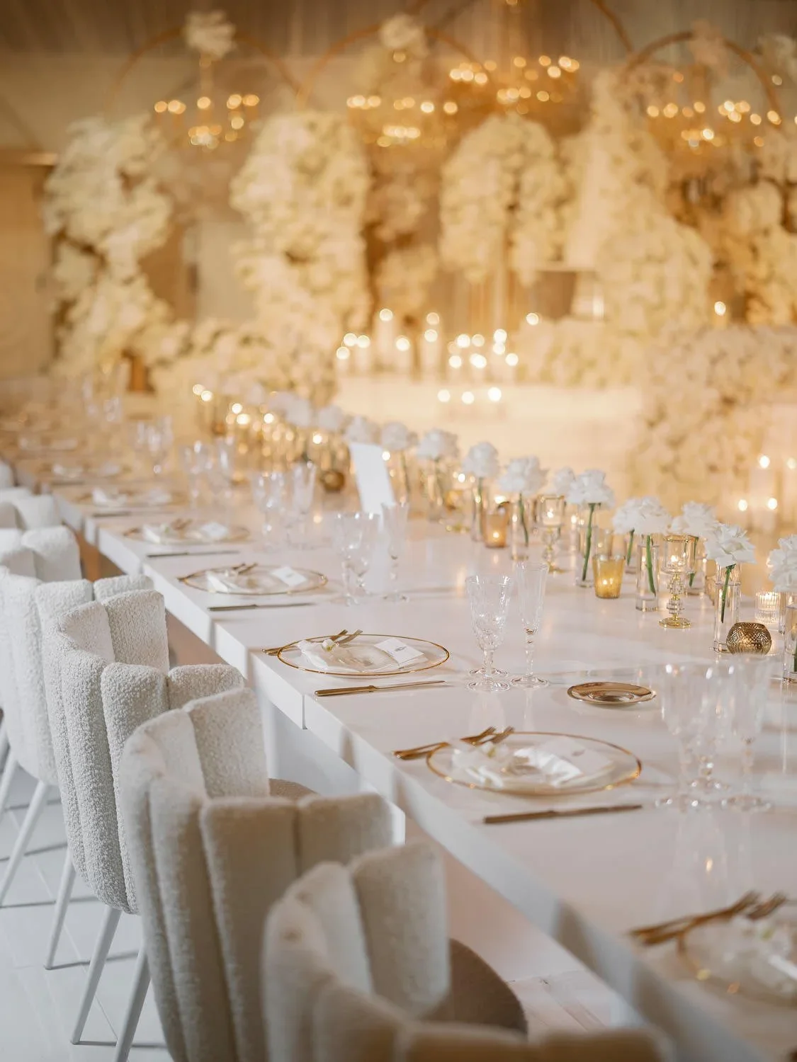
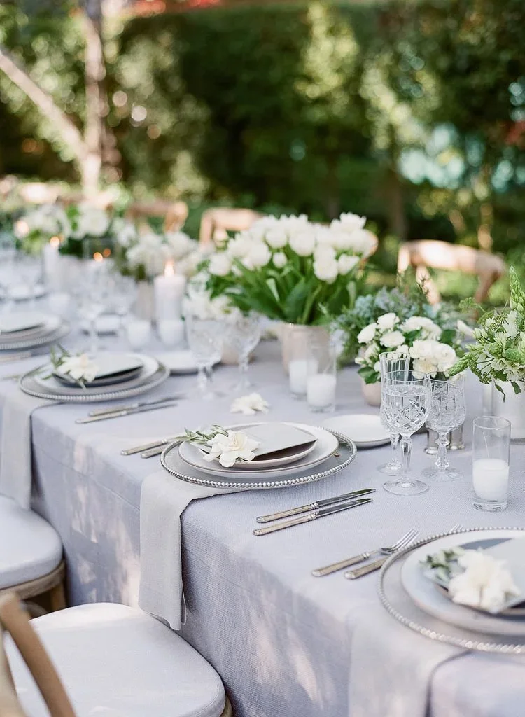
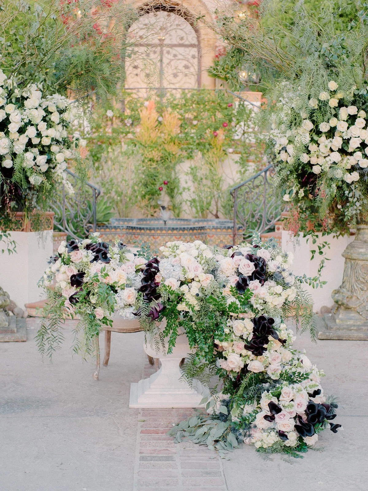
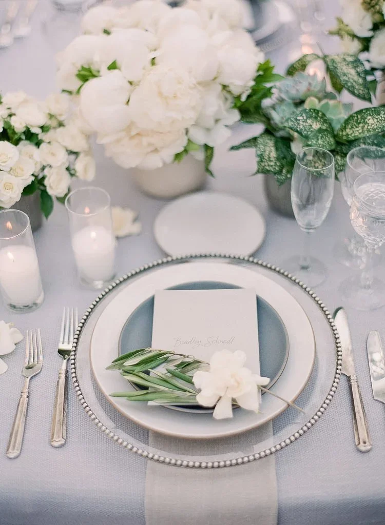
All-White Event Design With Cloud Dancer
All-white events demonstrate one of the most effective applications of Cloud Dancer. When color is intentionally restrained, the success of the design relies on proportion, texture, and layering. This approach creates an atmosphere that feels calm, elevated, and timeless rather than trend-driven.
In all-white wedding ceremony design inspiration, Cloud Dancer appears through expansive white floral arches, sculptural ceremony installations, and aisle florals that define space without visual competition. Because the palette is restrained, the viewer’s eye is drawn to form, movement, and scale, allowing the ceremony environment to feel immersive rather than minimal.
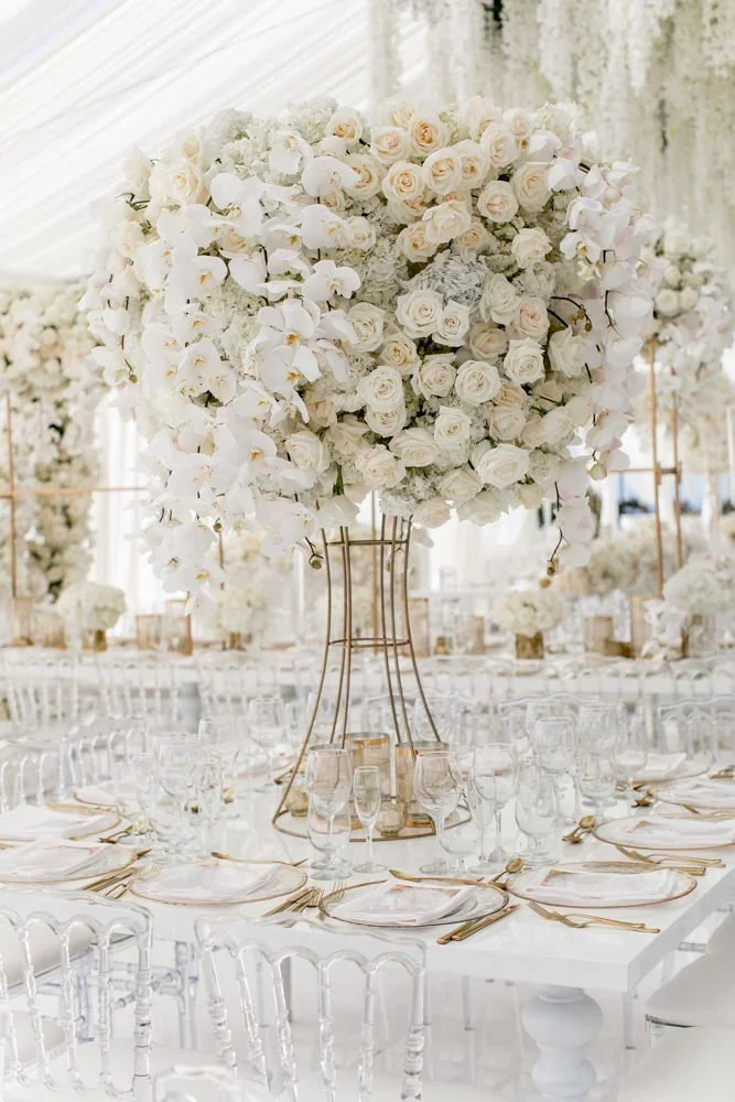
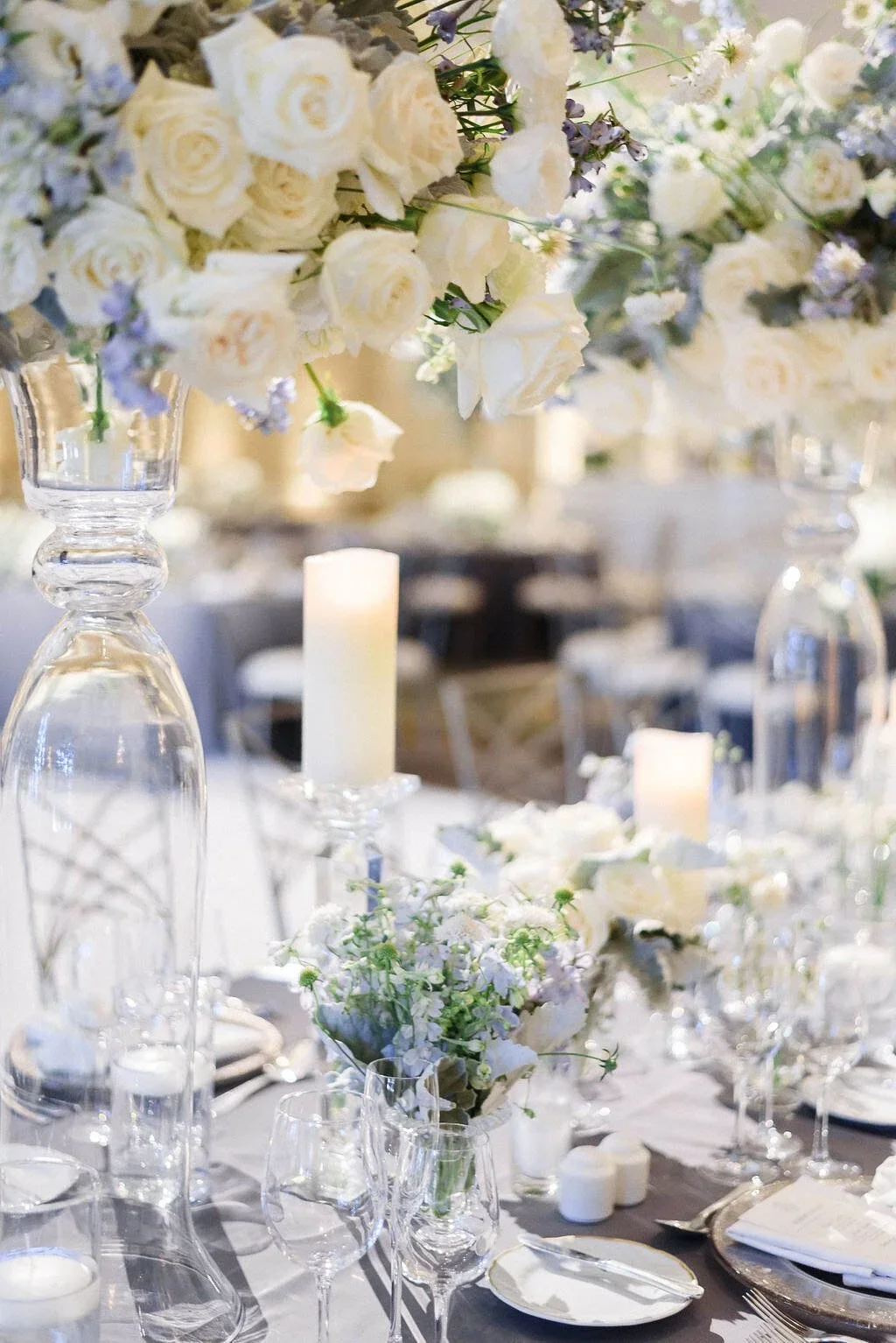
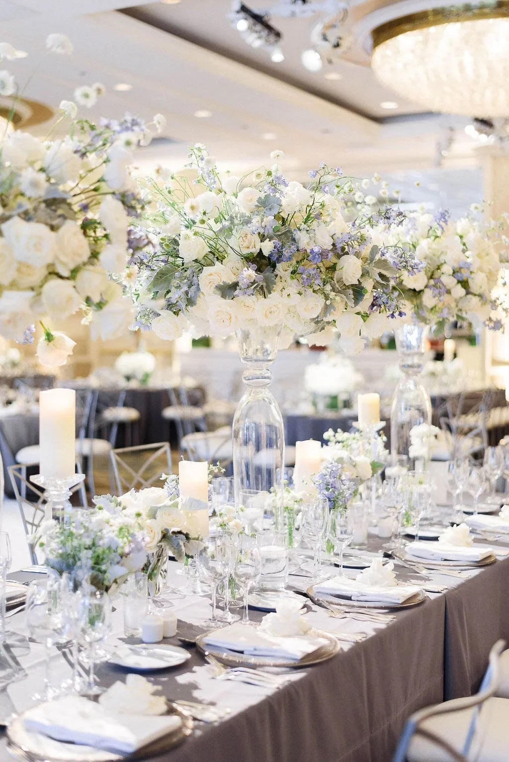
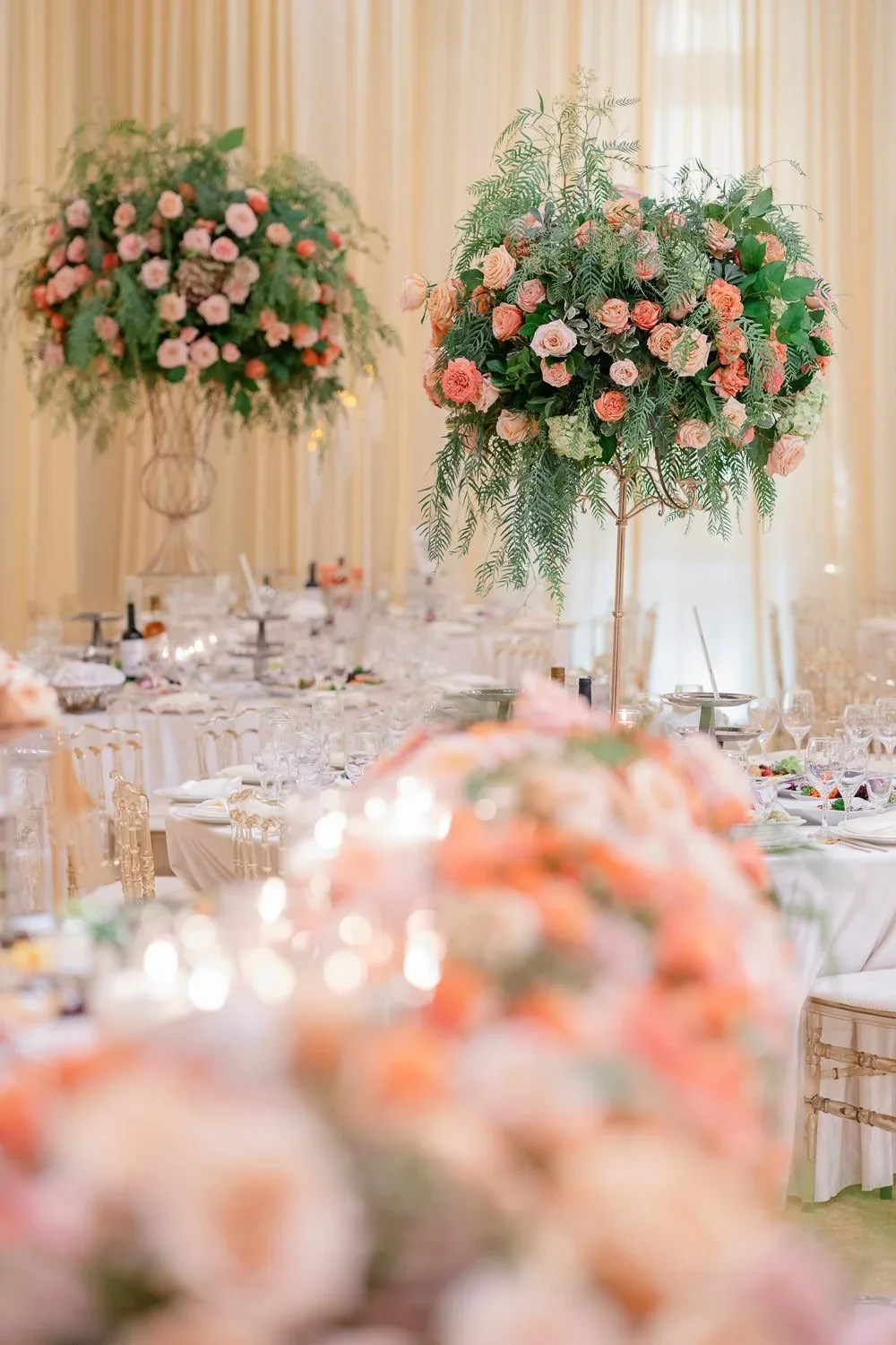
Reception designs grounded in Cloud Dancer rely on tonal variation instead of contrasting hues. White linens, porcelain or stone tabletop elements, soft draping, glass vessels, and candlelight work together to create depth. These layered whites ensure the space feels intentional and dimensional, reinforcing a cohesive design narrative.
Related: All-white wedding and all-white paty design inspiration


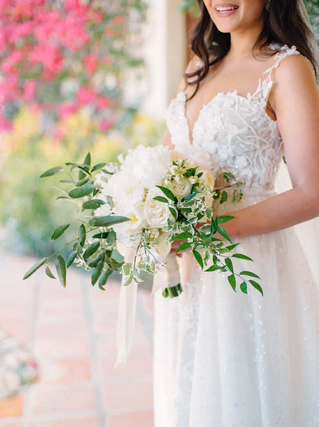
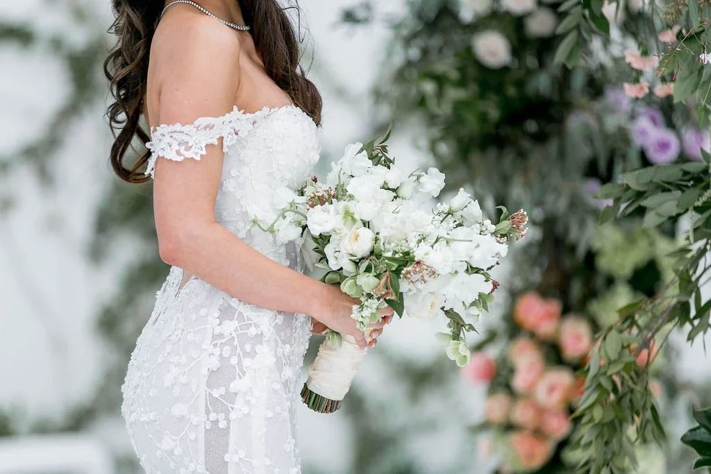
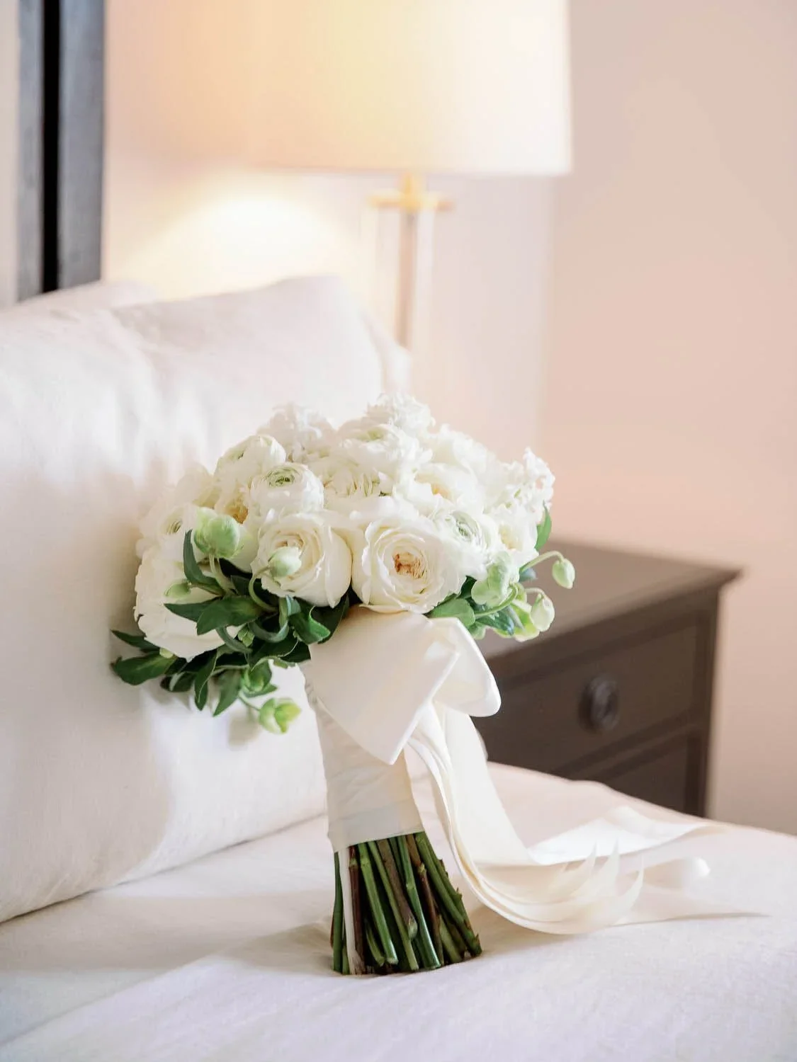
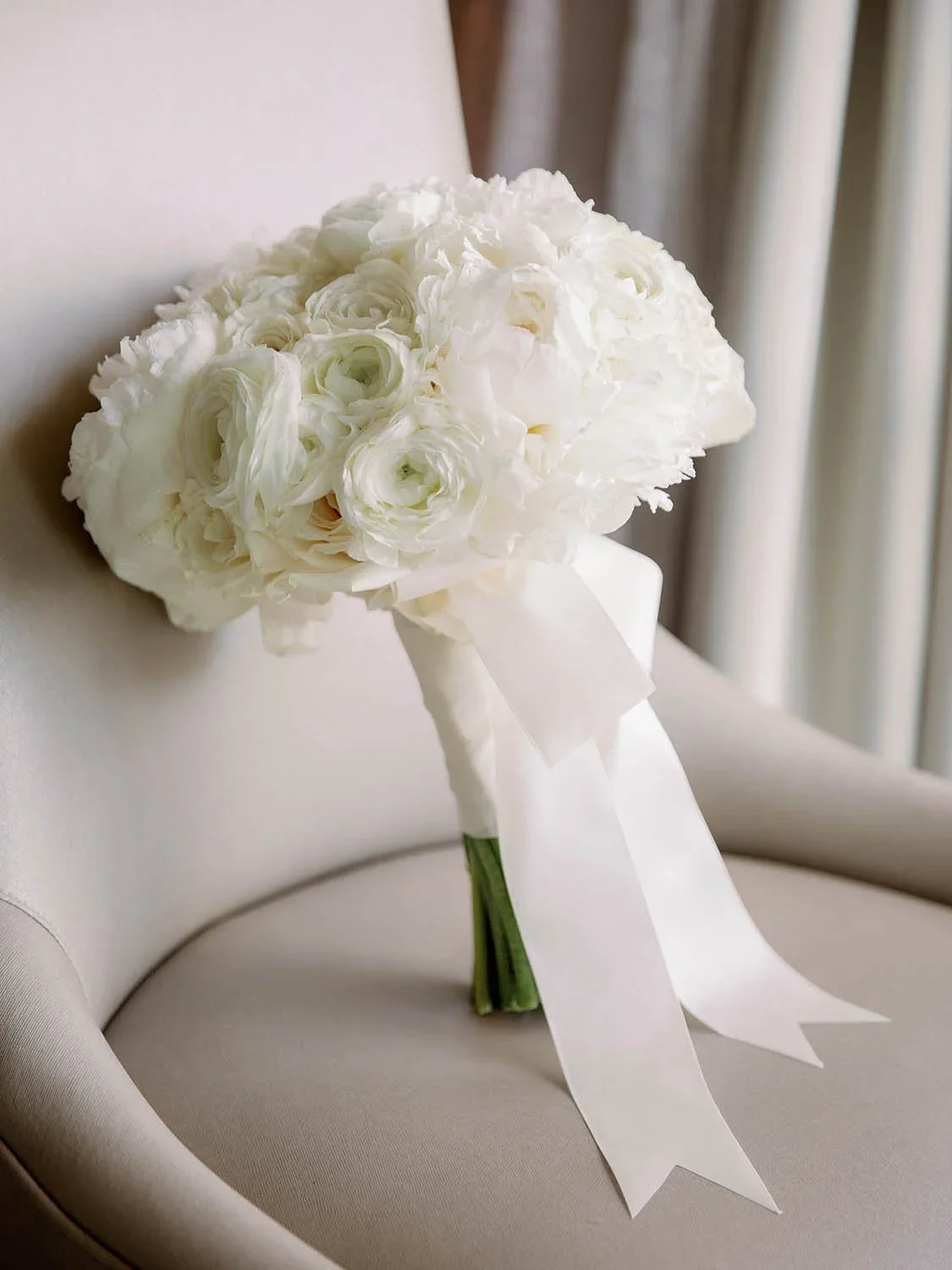
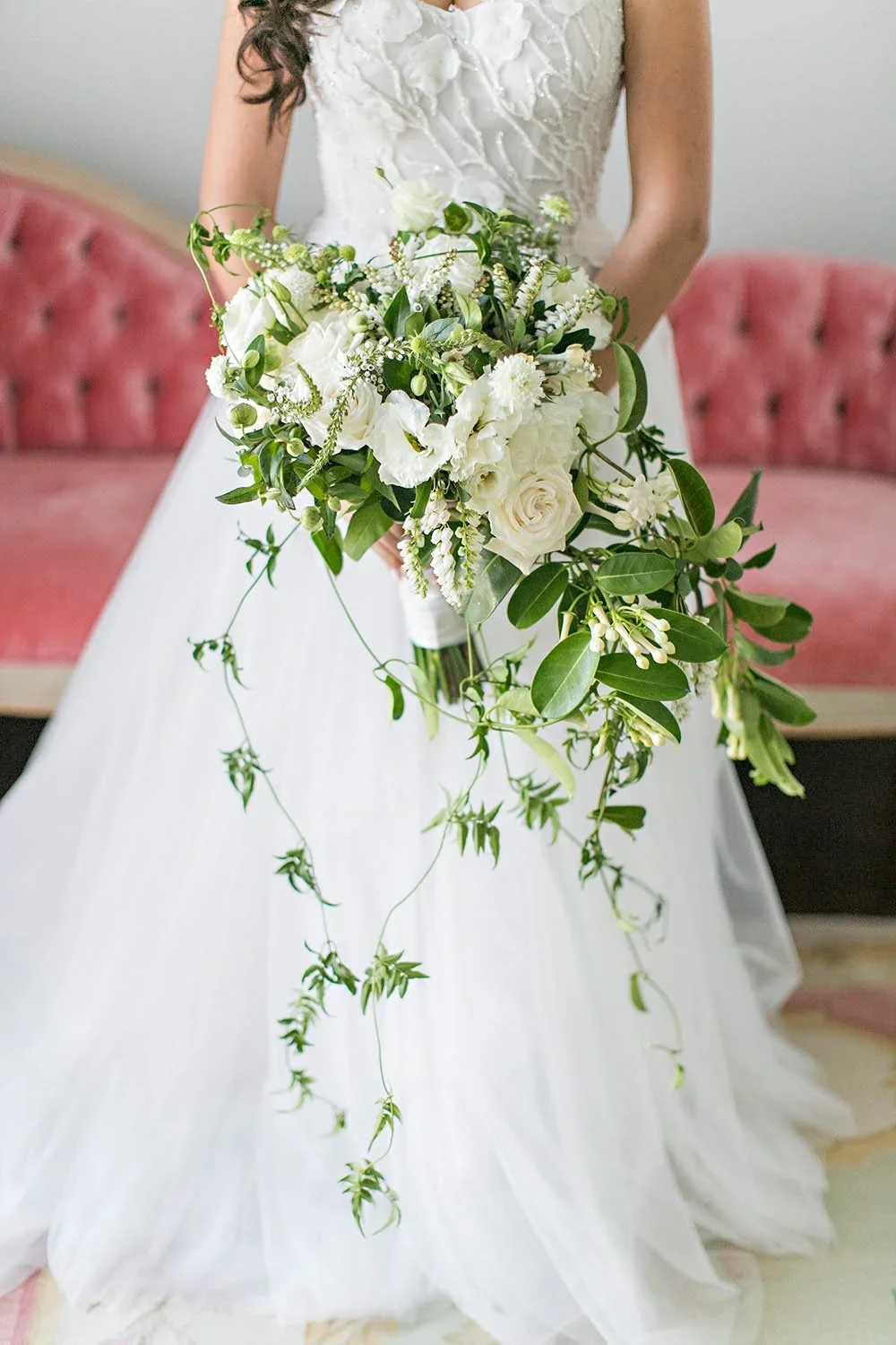
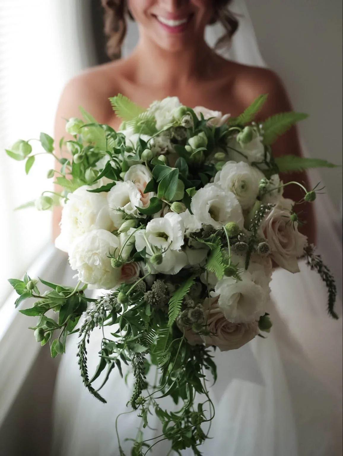
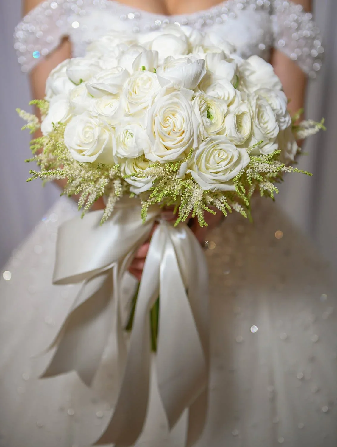
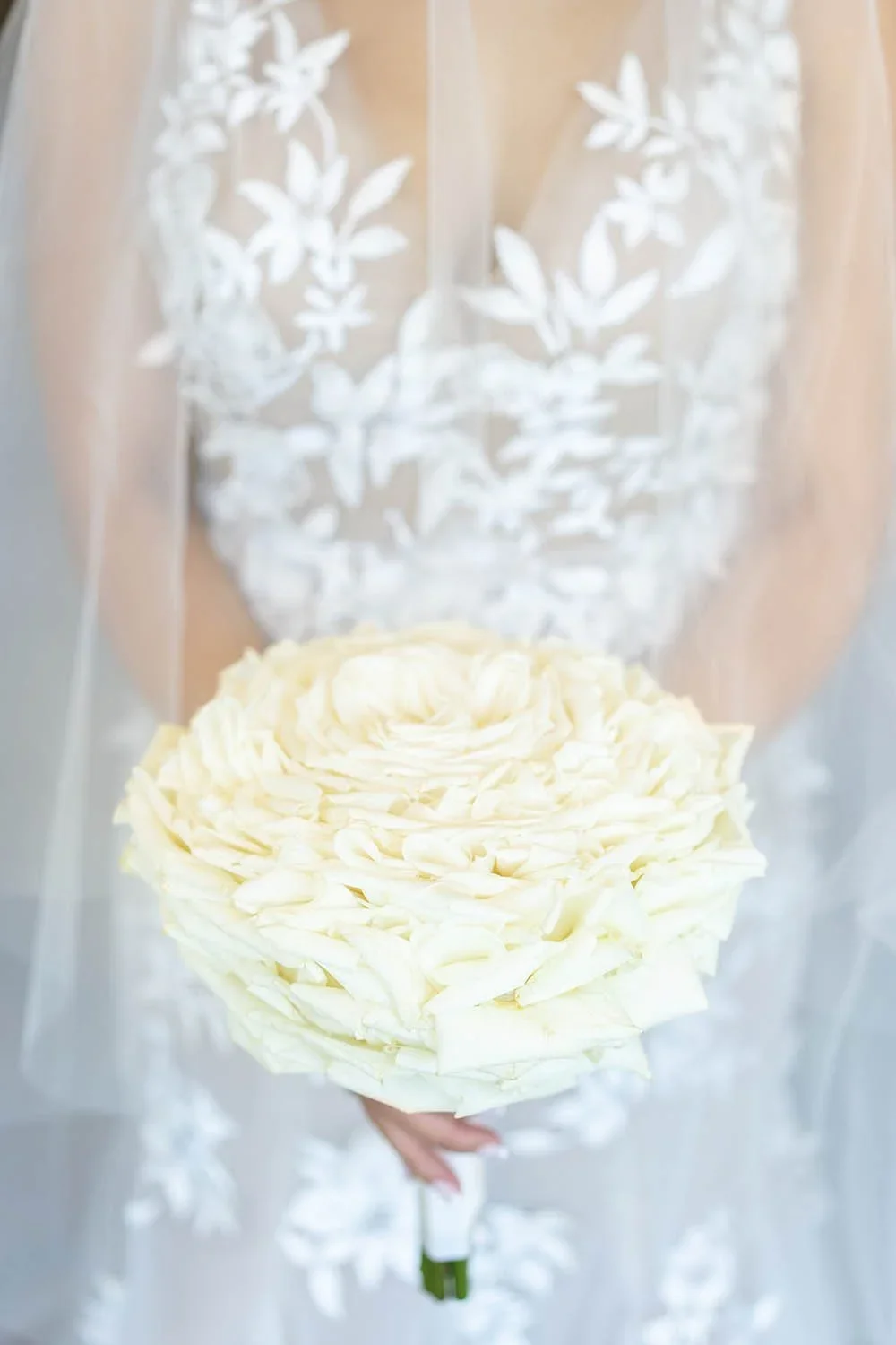
Romantic White Bridal Bouquets Inspired by Pantone Color of the Year 2026
Romantic white bridal bouquets align effortlessly with Pantone Color of the Year 2026, where Cloud Dancer functions as a refined foundation rather than a dominant statement. In this context, white is not treated as an absence of color, but as a framework that allows floral craftsmanship and texture to take center stage.
When applied to bridal floral design, Pantone Color of the Year 2026 encourages softness, movement, and organic shaping. Rather than relying on rigid structure, romantic white bouquets emphasize variation in bloom size, negative space, and natural flow—resulting in designs that feel effortless and intentional.
For those interested in understanding how these bouquets are thoughtfully assembled, this approach is explored in detail in a romantic white bridal bouquet DIY tutorial, which breaks down bloom selection, layering techniques, and shaping fundamentals.
Romantic White Bridal Bouquet with Soft Movement
Complementary Colors for Pantone Color of the Year 2026 Event Design
Although Cloud Dancer can stand alone, complementary colors play an important role in defining the tone of an event. Rather than overpowering the white base, accent colors provide warmth and emotional context while preserving cohesion.
Powdered Pastels and Pantone Color of the Year 2026
Soft pastel color palettes offer one of the most natural interpretations of Pantone Color of the Year 2026, as Cloud Dancer provides a luminous white foundation that supports color without overpowering it. Rather than acting as a focal point, Cloud Dancer allows pastel hues to feel integrated and intentional, creating environments that are calm, refined, and visually balanced.
Pastel tones such as blush pink, pale yellow, soft blue, muted lavender, and light green complement Pantone Color of the Year 2026 because they share a similar visual weight. Rather than competing with white, these hues blend naturally into a Cloud Dancer base, allowing color to enhance the atmosphere without dominating it.
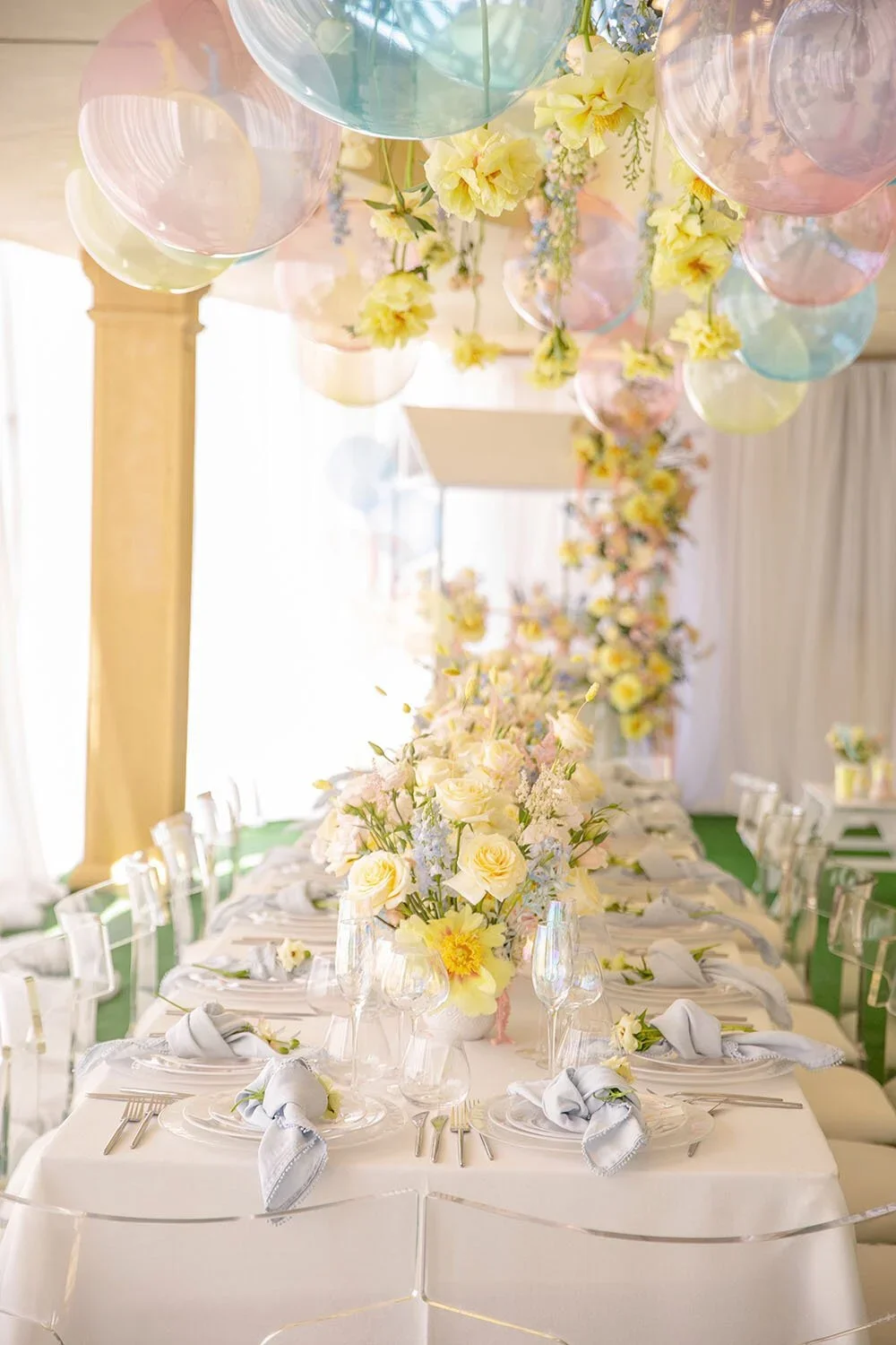
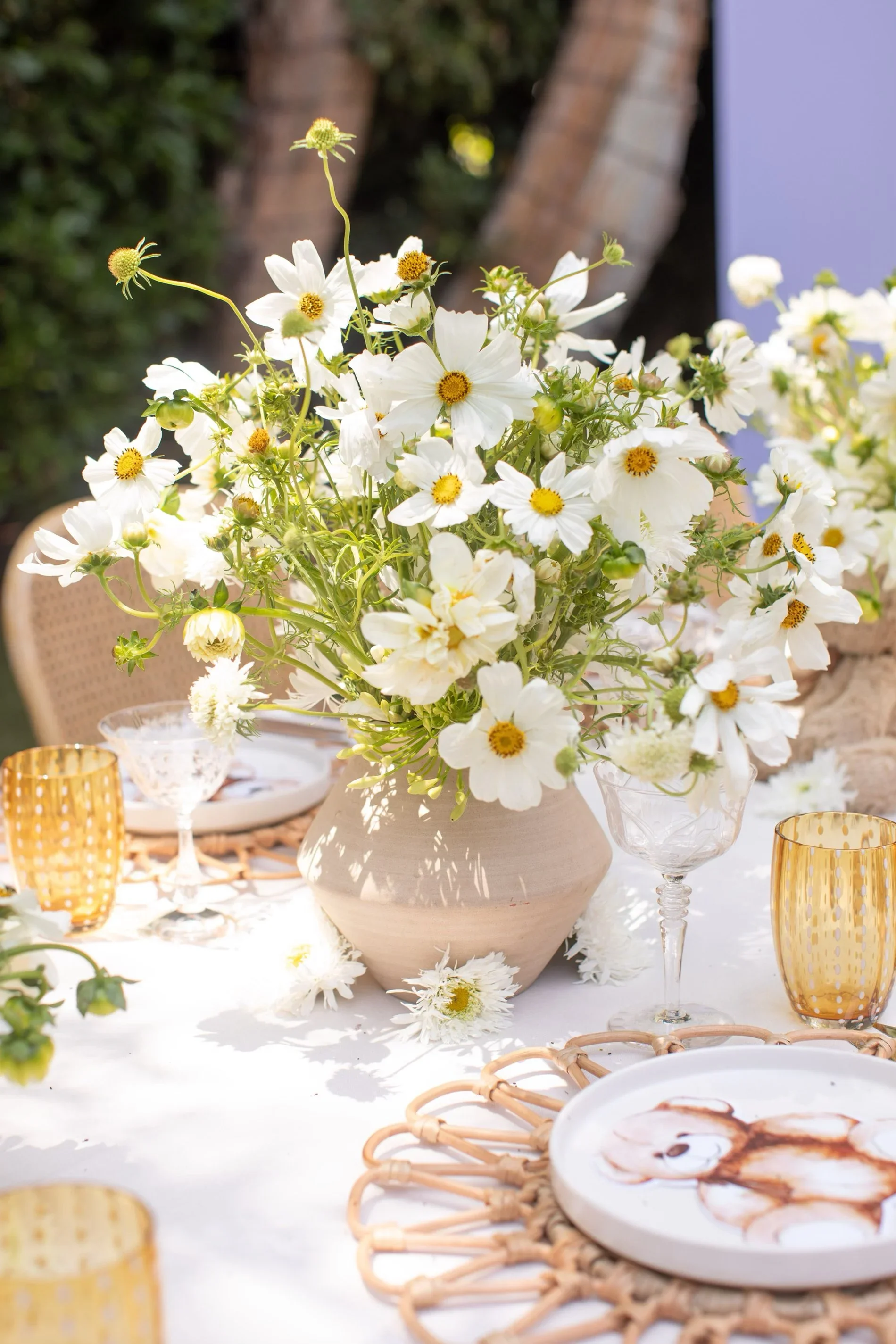
One of the most effective ways to introduce pastels alongside Cloud Dancer is through floral design. Pastel blooms layered into white and neutral arrangements add depth, softness, and movement, preventing designs from feeling flat while preserving a refined palette. This approach reinforces how Pantone Color of the Year 2026 can be expressive without relying on bold color saturation.
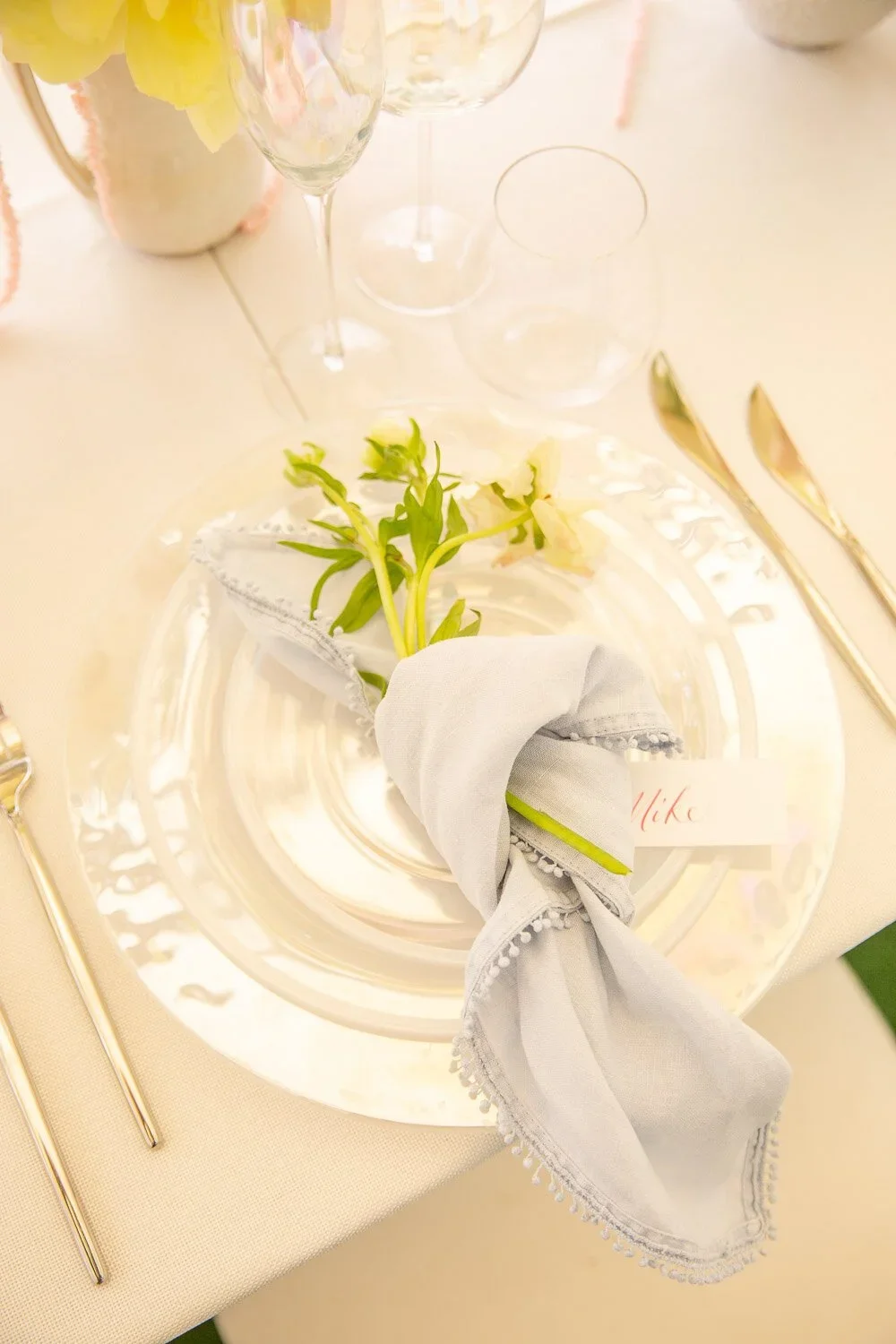
Soft Yellow with Pantone Color of the Year 2026
Soft yellow adds light and optimism when paired with Pantone Color of the Year 2026, Cloud Dancer. Within Pantone’s Powdered Pastels color palette, yellow is most effective as a supporting accent rather than a dominant shade.
Yellow pairs especially well with Cloud Dancer, Pantone’s Color of the Year 2026, because both colors share a light, airy quality. Cloud Dancer’s soft white base allows yellow to appear warm and optimistic without becoming overwhelming. Instead of competing for attention, the two colors support each other visually.


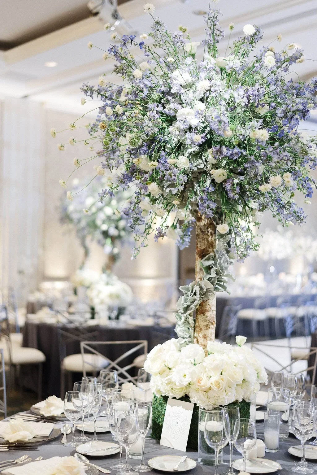
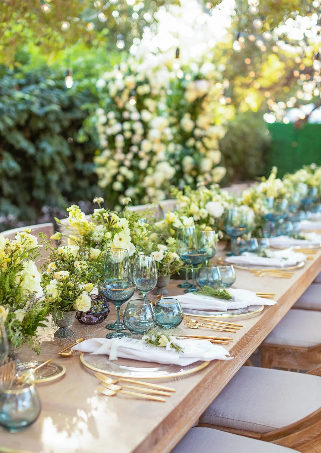
Soft Blue and Light Green Color Pairings with Cloud Dancer
Soft blues and airy greens are often the first pastel tones to integrate naturally with white. These colors feel fresh and calming when paired with Pantone Color of the Year 2026, especially when they appear through florals and foliage rather than hard décor elements.
Pale blue blooms and light green stems introduce movement and freshness while maintaining the calm, open quality that Cloud Dancer brings to a space.
For weddings, light blue and green florals paired with white help guide the eye naturally throughout the event. From ceremony arrangements to reception details, these colors maintain continuity while allowing each design moment to feel distinct.
In baby showers and baptisms, this palette feels especially appropriate. Light blue conveys tenderness, while soft green symbolizes growth and renewal. When combined with white florals and neutral accents, the result is calm, meaningful, and emotionally grounded.
From a photography perspective, these combinations perform beautifully. White reflects natural light evenly, allowing pale blues and greens to remain soft and accurate on camera. The resulting imagery feels airy and timeless—perfectly aligned with the understated elegance of Pantone Color of the Year 2026.
Related: Spring Wedding Color Palette - Grass Green & Sky Blue
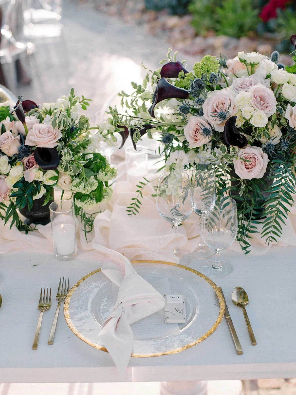
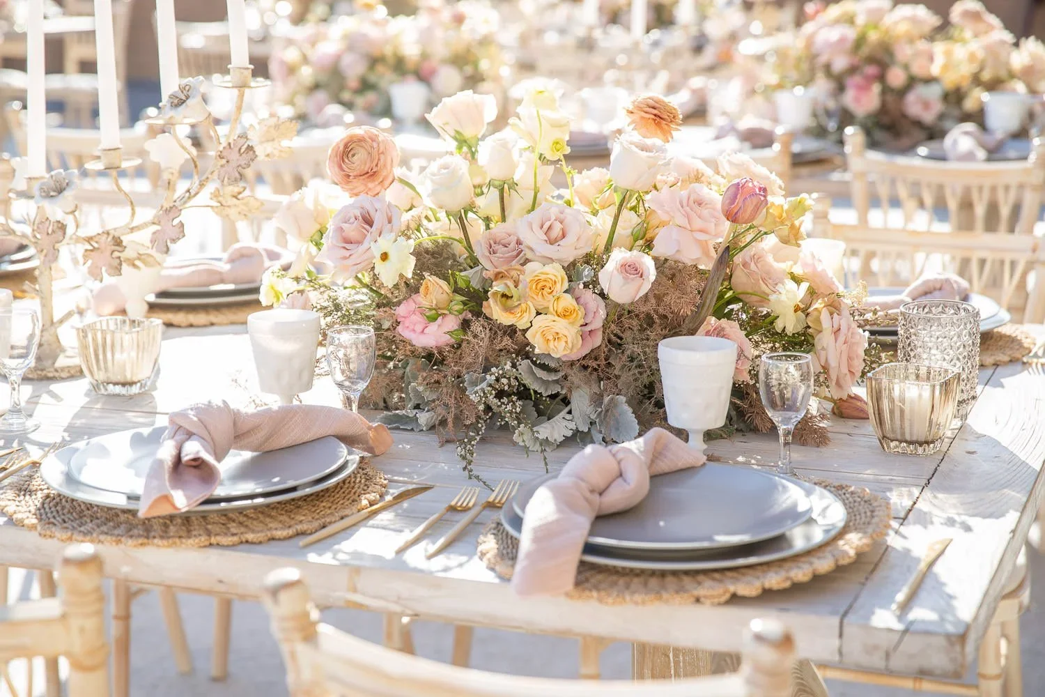
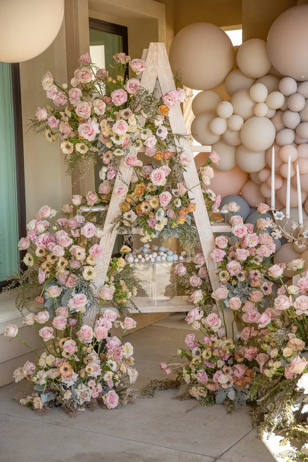
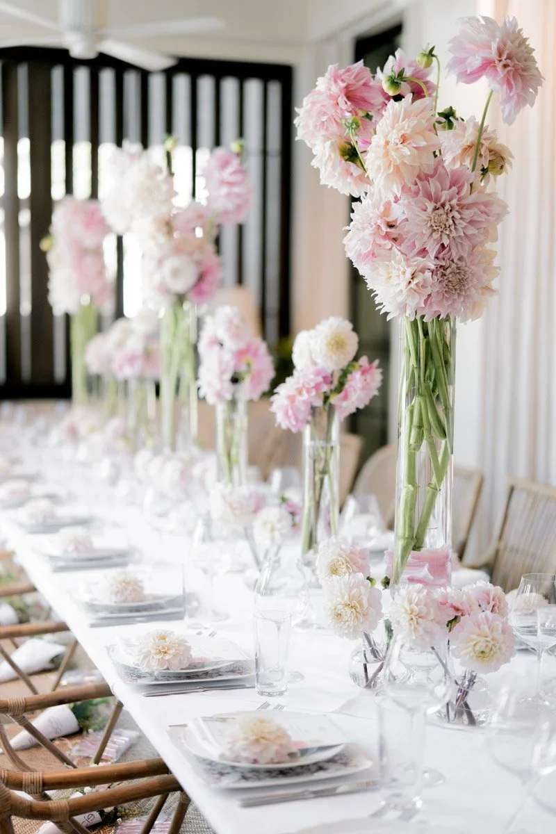
Lavender and Pink Color Palettes Inspired by Pantone Color of the Year 2026
Lavender and pink color palettes are a refined way to interpret Pantone Color of the Year 2026, especially when Cloud Dancer is used as the primary foundation. Rather than leading with color, this palette works best when white creates the structure of the event and pastel tones are layered in thoughtfully through florals and accents.
Cloud Dancer, Pantone’s 2026 Color of the Year, provides a luminous white base that allows lavender and pink to feel soft, balanced, and intentional. This approach keeps pastel color palettes elegant rather than decorative and ensures long-term visual relevance.
How to Use Cloud Dancer with Lavender and Pink Color Palettes
In event design, Pantone Color of the Year 2026 should appear first through structural elements. White tables, chairs, linens, and backdrops establish consistency and clarity across the space. This Cloud Dancer foundation prevents pastel tones from becoming visually overwhelming.
Lavender and pink work best when introduced through floral arrangements rather than large décor elements. Lavender adds coolness and depth, while pink introduces warmth. When surrounded by white blooms and neutral textures, both colors enhance the palette without dominating it.
Why Lavender and Pink Work with Pantone Color of the Year 2026
Pantone designed Cloud Dancer to function as a flexible neutral that supports a wide range of color palettes. Lavender and pink pair particularly well because they share a similar softness and tonal lightness, allowing them to blend naturally with white instead of competing against it.
This makes lavender and pink color palettes ideal for weddings, baby showers, baptisms, and milestone celebrations that require a calm, elevated aesthetic.
Best Events for Cloud Dancer, Lavender, and Pink Color Palettes
This palette works particularly well for:
Weddings seeking romance without excess
Baby showers and baptisms that feel gentle and meaningful
Milestone celebrations that balance softness with structure
In each case, white establishes the foundation, while lavender and pink guide emotion through floral accents and subtle design details.


White with Bold Color Palettes Inspired by Pantone Color of the Year 2026
While Pantone Color of the Year 2026, Cloud Dancer, is often associated with softness and restraint, it also functions as a powerful foundation for high-energy color palettes. When white leads the design, it creates space for bold hues—such as bright pinks, tropical turquoise, citrus tones, and rich coffee shades—to coexist without overwhelming the environment.
Pantone Color of the Year 2026, Cloud Dancer, works especially well when you want energetic color without visual chaos—because it functions like a soft, luminous “breathing space” around brighter hues. That’s exactly why Pantone’s palette concepts like “Tropical Tonalities” and “Take a Break” resonate for events: they’re both about pairing upbeat color with a calm, airy foundation so the overall look still feels polished and intentional.
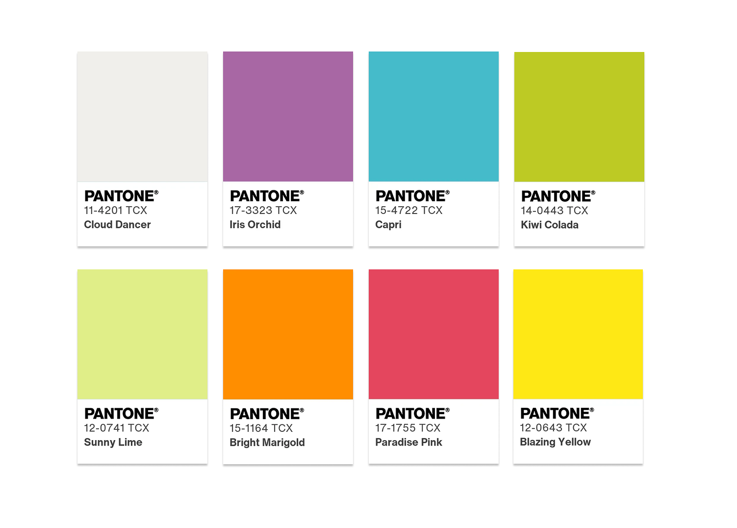
Pantone Tropic Tonalities: Turquoise, Bright Pink, and Citrus with White
The Tropic Tonalities Pantone palette embraces vivid, sun-washed hues—think turquoise blues, saturated pinks, citrus oranges, and lush greens—balanced by the softness of Cloud Dancer. In event design, this translates to white-led spaces energized by selective bursts of color, rather than fully saturated rooms.
White tables, chairs, linens, and architectural elements provide clarity, allowing bold florals or accent details to feel intentional and buoyant rather than chaotic.


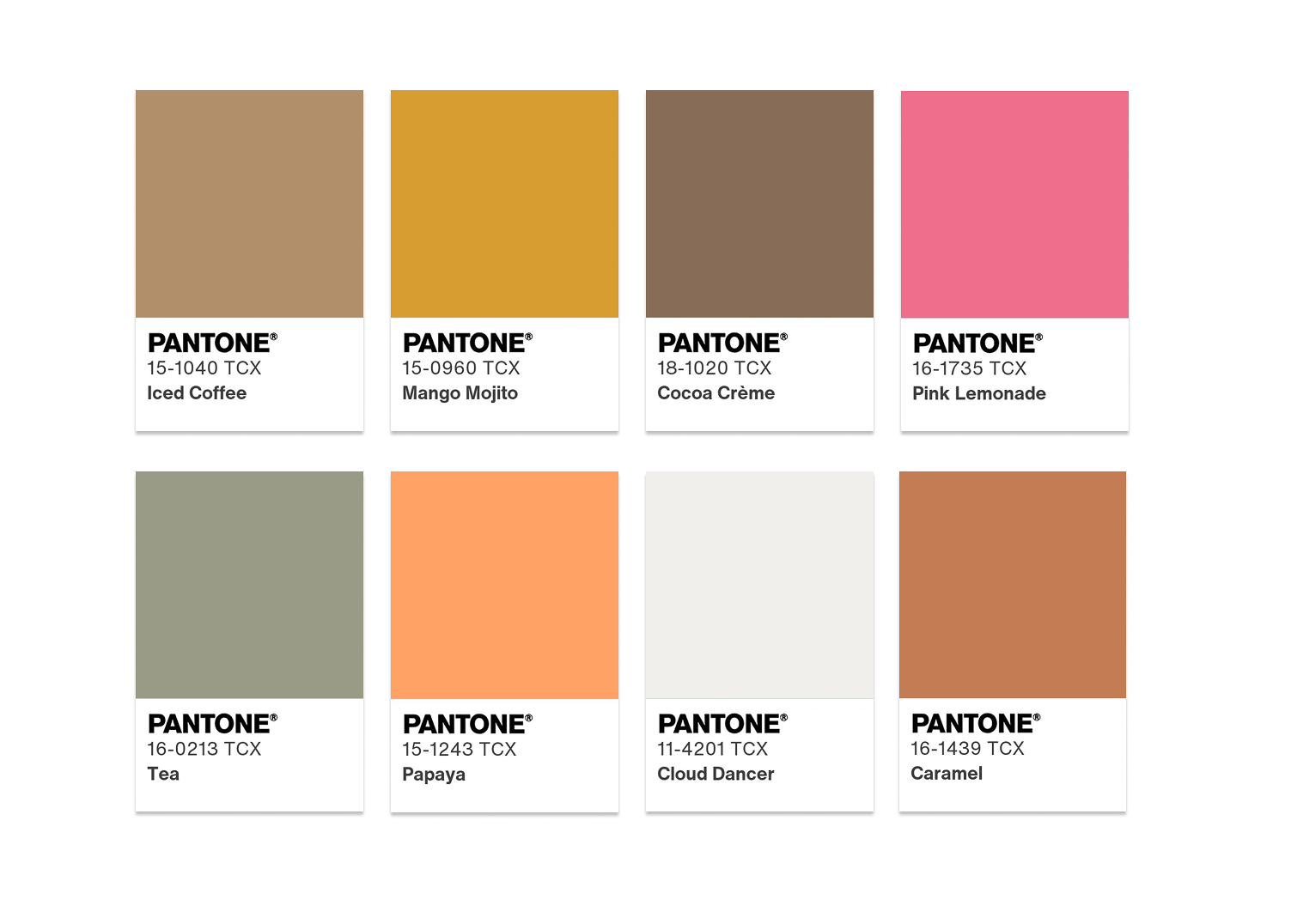
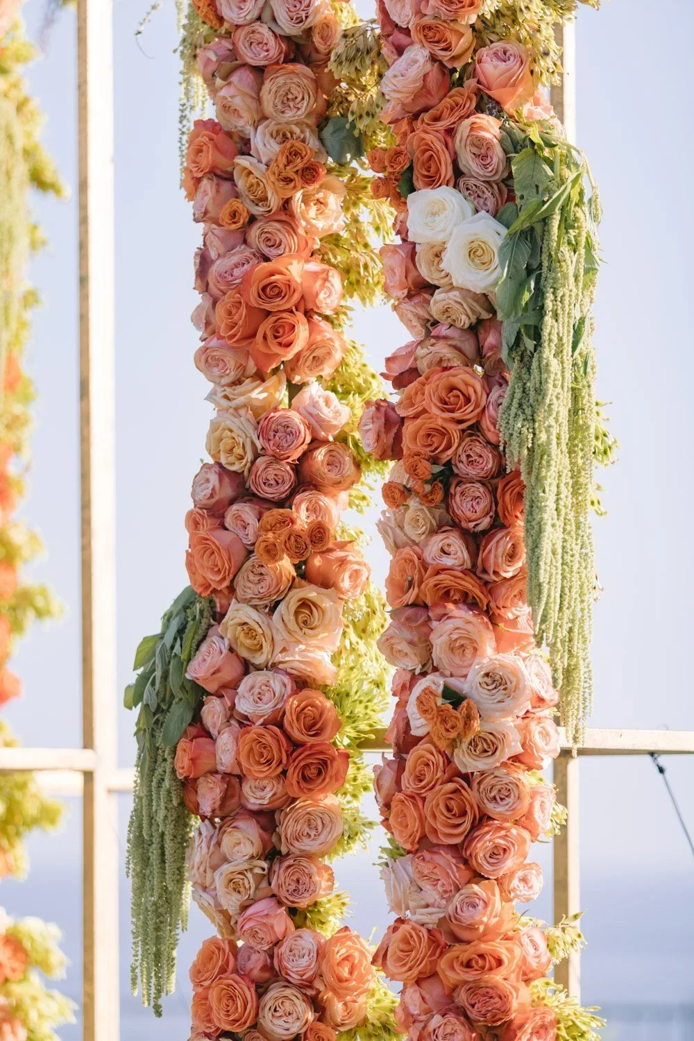
Pantone Take a Break: Coffee Tones, Warm Neutrals, and Pops of Color
Pantone’s Take a Break palette explores richer, comforting hues—coffee browns, caramel, cocoa, mango, and soft citrus—designed to feel indulgent and warm. When layered over Cloud Dancer white, these tones gain sophistication and balance.
For celebrations seeking warmth and personality, coffee-toned florals or caramel and mango accents layered over white linens, chairs, or backdrop fabrics infuse quiet sophistication. Consider coffee-bronze table accents or papaya-colored napkins against a white tablescape paired with soft pastel flowers — this creates a multi-dimensional color story that feels both bold and cohesive.
Instead of dominating the space, coffee tones and warm neutrals appear through florals, vessels, linens, or accent décor, while white maintains visual cohesion. Brighter accents—such as hot pink or citrus—can then be introduced to keep the palette dynamic and fun. Against a Cloud Dancer foundation, even neon-leaning colors read as elevated rather than overwhelming.


Applying Bold Color Palettes to Weddings and Celebrations
Designing with Cloud Dancer, paired with bold accents inspired by Tropic Tonalities and Take a Break, works particularly well for:
Weddings seeking energy without visual overload
Birthday and milestone celebrations with personality
Destination-inspired events and outdoor receptions
Celebrations that blend softness with confidence
White ensures longevity and elegance, while bold hues bring expression and joy—proving that Pantone Color of the Year 2026 supports far more than minimalism alone.
Looking to Create Cloud Dancer Color Themes For Your Next Event?
Contact our design team to apply Pantone Color of the Year 2026 to your next event or interior space!