
Color Palettes
There’s nothing I love more than designing with COLOR! Explore these gorgeous wedding and event color palettes ideas.

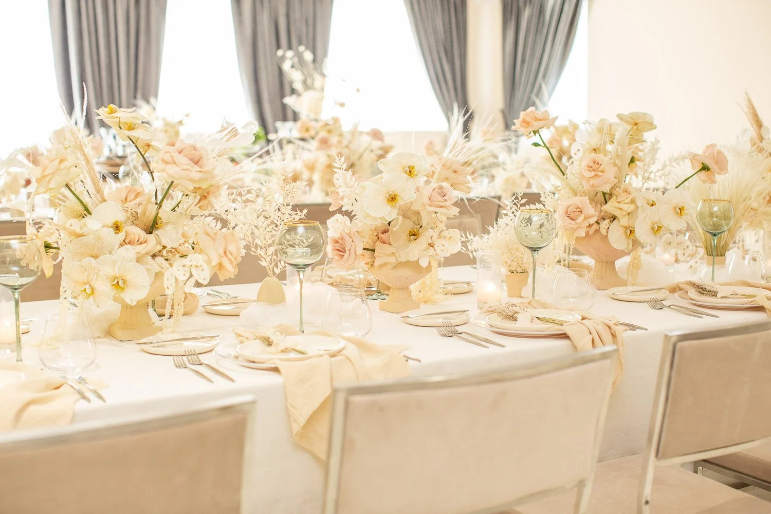
If you love the look of a classic white wedding, but want to add some warmth and softness to your celebration, look no further than this Black, Ivory, Taupe and Champagne Wedding Color Palette!

White weddings are classic and timeless, but also allow for a surprising amount of creativity in their design! Read on to explore ways I’ve designed weddings with white color palettes and made them into personal, breathtaking celebrations for my clients.

This season’s cherry red aesthetic trend is taking fashion, beauty, home decor and event design by storm. Here are my design tips to make your cherry red event look a success!

ondering how to use Mocha Mousse, Pantone’s 2025 Color of the Year, in your wedding, event or home decor? Let’s explore!

What do you see when you think of a sunset? From the deepest colors to the palest, they all make an appearance in this sunset inspired wedding color palette.
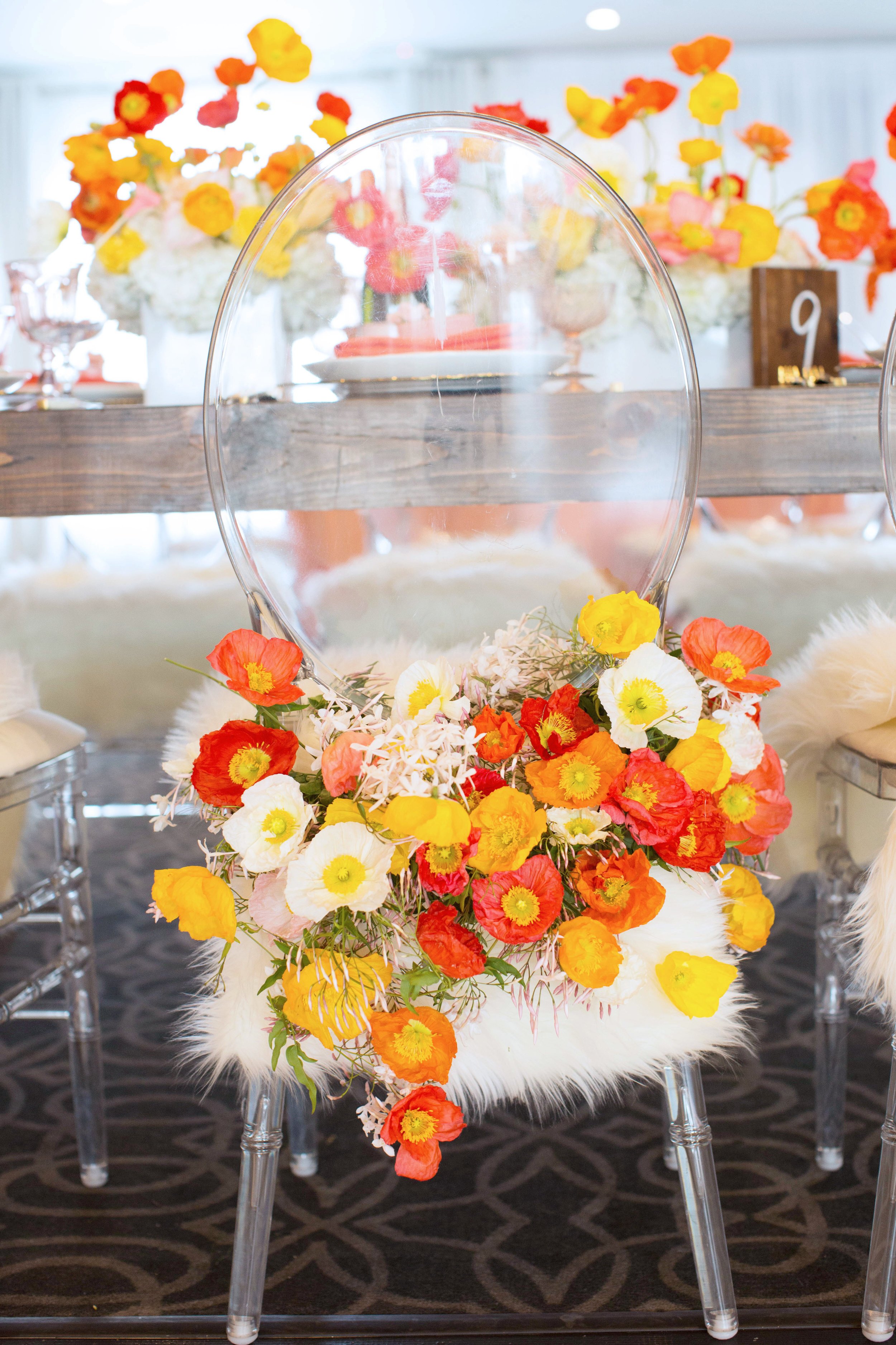
There are no rules when it comes to wedding color palettes - If a traditional color palette just isn't you, GO VIBRANT! I love designing with bright, energetic color combinations - here are 3 ideas.

Ready to Decorate your next event with bold and Bright COLOR? Here are my top tips for doing it right!
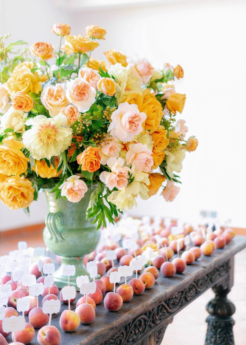
I love designing with the color peach for its warmth and welcoming energy, and for its versatility. Here are three creative ways to think outside the box and use peach in fun and unexpected ways…

In spring and summer when the weather is at its best, I’m tasked with designing event decor that can flow from a garden to a ballroom without missing a step. For this Beverly Hills Hotel wedding, we embraced the simplicity of an all white color palette, and let it play up the legendary green and white palette of this famous hotel.

I love working with all shades of orange in my wedding and event designs - from deep, earthy terracotta and rust, to vibrant tangerine and peach. Here are two ways you can work with an orange hued color palette…

This summer wedding at the Ritz-Carlton Laguna Niguel, had not one, but TWO spectacular color palettes! Bright coral, peach and pink for the ceremony, and cream, gold and blush for the reception. Come see how we did it!

Nothing represents spring like an abundance of colorful blooms! Read on to learn how we used a multi-hued floral color palette to create this modern spring garden party wedding with unexpected, delightful touches!
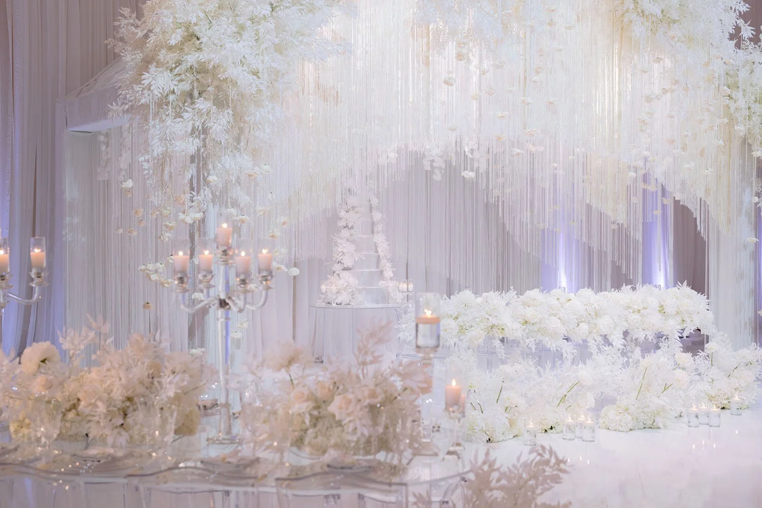
When planning your winter weddings color palette, don’t feel like you need to be limited to only dark tones or classic holiday colors. Any color combination can bring a winter event to life! I’ll show you how…
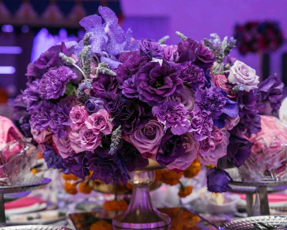
Are you planning a fall wedding? It’s one of my favorite seasons to design for because it lends itself so well to rich, luxurious wedding color palettes, and I love working with color! To bring you some wedding color inspiration I’ve put together three wedding mood boards that are perfect for fall celebrations.

As soon as Pantone announced its 2021 colors of the year, I got excited to put together some yellow and gray tabletop design ideas and inspiration - check it out!

When the party is for one of your event industry friends, you know the creativity involved is going to be through the roof! I had such a good time collaborating with my event industry family to create this ultimate baby blue baby shower for my dear friend and photographer Melody Melikian. We found the perfect shade of light blue and built the entire event’s design around it. It was modern, monochromatic and minimalist, and so much fun.

Spring & summer parties feel all the more exciting when they have decor in a bold, bright color palette! For this beautiful outdoor spring engagement party, I used multiple shades of rich red, pink, purple and lavender.

If autumnal colors aren’t for you, try a fun fall alternative using classic blush pink! From bright to light to rustic, there’s a blush wedding palette for everyone!

How do you create a vibrant, refreshing, playful atmosphere for a 1st birthday party (that the adults will enjoy as much as the children)? Turn to the magic of flowers in your decor! At this darling little girl’s 1st birthday party, we used a sweet pastel color palette of pale yellow, pink, blue and green to elevate the at-home party experience for everyone in attendance.
Using a sweet pastel color palette focused on pale yellow, pink, blue and green
Monochromatic designs done right make a strong statement and never go out of style! I put together a few floral and decor design tips to help you when designing your own monochromatic event decor.

Spring is in the air in my design studio, and I’m feeling inspired by the wedding color palette of grass green and sky blue for spring weddings!

Pantone announced it’s 2020 color of the year, Pantone 19-4052 Classic Blue, and to me, blue brings a sense of calm and tranquility. I think it’s the perfect color to be on-trend for a new decade.

What’s more dramatic than a red, black and gold wedding color palette? Max and Lisa’s wedding reception at the Intercontinental Los Angeles Downtown was filled with floral arrangements of classic red roses and deep wine colored dahlias that created an opulent, modern atmosphere for this wonderful couple’s friends and family to enjoy.

As a focal point for Christian and Narineh’s wedding reception, Eddie and his team designed a dramatic sweetheart table overflowing with thousands of white and blush hued roses.

There is something so timeless and chic about a white and gold color palette when it comes to celebrating your wedding day. For Suzy and Daniel’s big day, we used white and gold florals and containers with touches of green to help define all the pretty details in the white roses, white hydrangea, white spray roses and dendrobium orchids adorning the banquet hall.
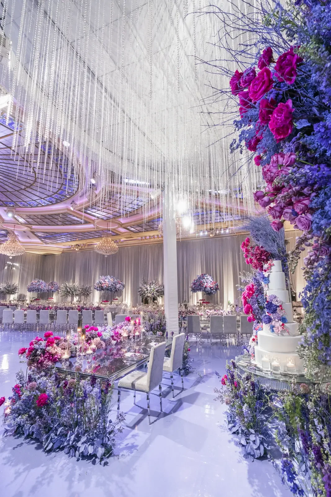
We design a range of purple wedding theme florals — from deep plum and eggplant to soft lavender and iris — bringing bold color and drama to every celebration.